Steve & Nicole Connolly
Brand Identity Residential Real Estate
Wellesley, MA – 2024
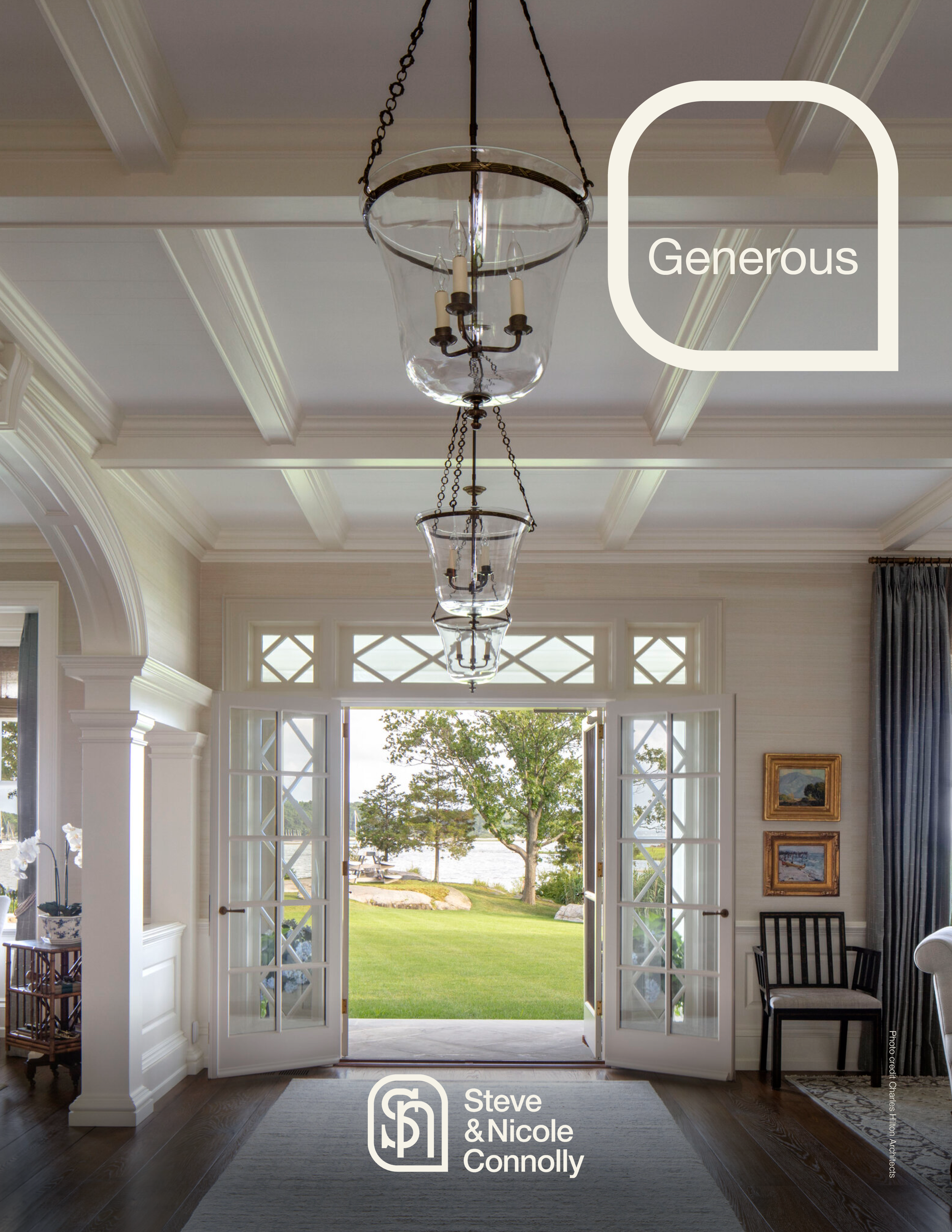
A new brand identity system, including logo suite, color palette, and graphic assets, for an ambitious residential real estate business based in MetroWest Boston. Owned and operated by a married couple, the brokerage’s offerings range from luxury urban properties in the heart of Boston to affluent suburban neighborhoods west of the city. Following a brand visioning session, key attributes for the partnership included trustworthiness, generosity, commitment, youthful energy, and efficiency. Leaning into the idea of a “power couple,” the chosen monogram featured a classic serif “s” interlaced with a geometric san serif “n,” combining both a formal conservatism with a more open, modernist style. Using the same line weight, the overlapping letterforms are enclosed with a simple shape, reflecting both generous curves and a hard-edged corner. The end result is an identity system that represents the unity of purpose and the potential for future growth.
Creative Director & Graphic Designer – Sandman70 Design


Brand Identity Look Book
Despite the requirement to design an identity system that was simple and easy to use, the client needed guidance demonstrating how the brand could be applied in the field, to merchandise, and to marketing materials. As a result, a look book was designed to showcase the brand’s attributes, flexibility, and color usage.


Additional Design Exploration
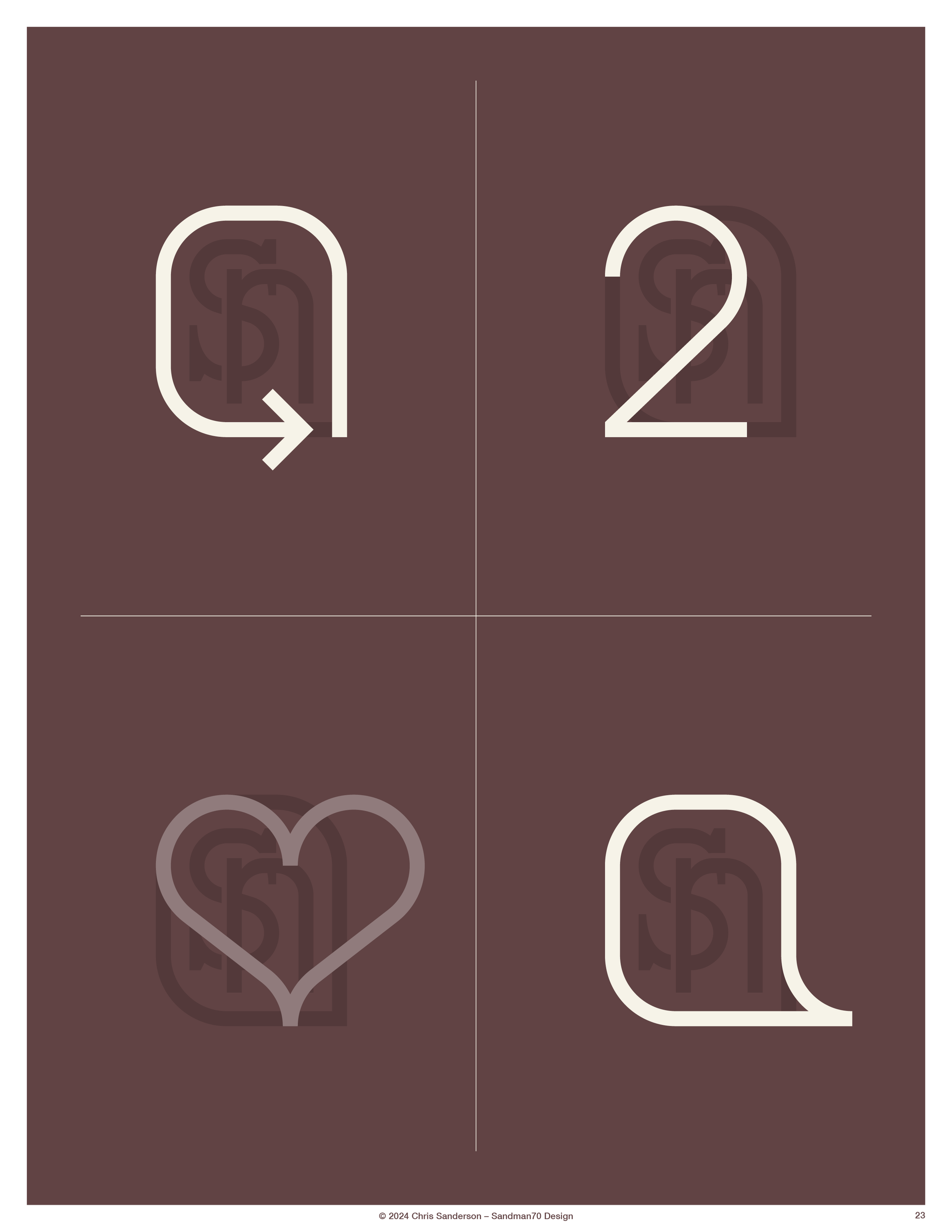
The client was relatively new to the development process used in creating a brand identity system, so several rounds of design were needed to explore the many graphic styles and iterations possible for a monogram logo. Some of that design exploration is shown below.
